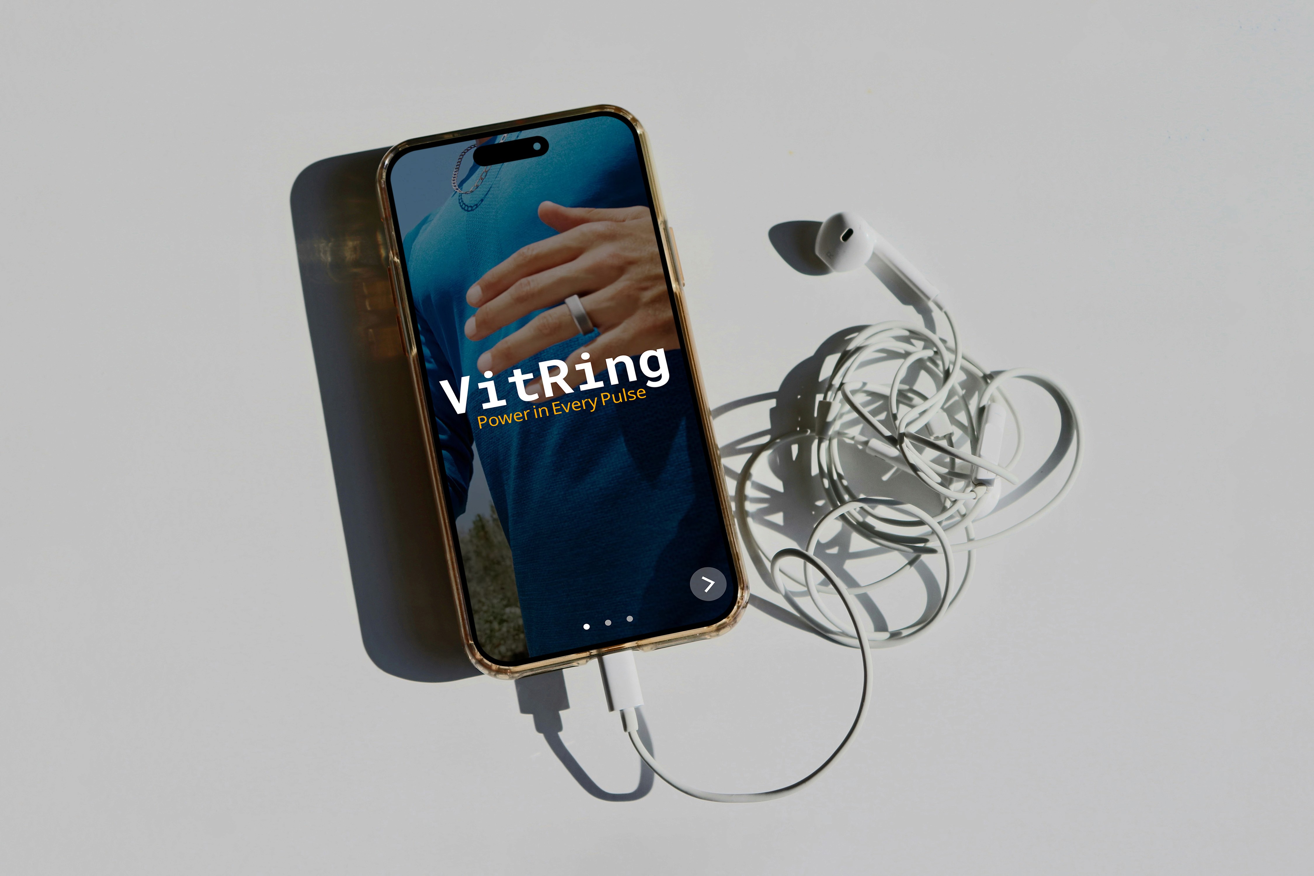
VitRing
Timeframe:
2 Weeks
Role:
UX/UI Designer & Researcher
Tools Used:
Figma & Photoshop
Project Type:
Product Ideation
Case Study
Project Overview
This project explores health wearables through the development of a smart ring called Vitring, that monitors and transmits blood pressure data to a user-friendly mobile app while also connecting information to medical professionals. The system not only tracks readings in real time, but also alerts users to abnormal levels, offers personalized exercises and recommendations to help restore healthy blood pressure, and logs the blood pressure readings for medical professionals to track their patients.
Deliverables
Competitive Analysis
User Persona
At least 5 High Fidelity mobile screens

Competitive Analysis
To start my project, I researched the health wearable industry to get a general idea of the many factors that go into creating a mobile application for users. I did a deep dive into four existing health wearable brands and compared them to generate success and pinpoints within these applications.

Competitor Pain Points
Samsung Health
Complex visualizations and UI
Manual BP Entry
Complex Navigation
Exercises & Solutions are generic
Does not connect to healthcare professionals
Apple Health
Not specialized in BP tracking
Not compatible with Android users
Does not connect to healthcare professionals
Omron
No exercise recommendations
Does not connect to healthcare professionals
Solutions
Specialized BP Tracking
Meaningful solutions to mediate health
Connection to medical professionals
Defining a User
Before continuing to the prototyping phase, I had to define a user persona. Who is this app meant for? How will they use it? What are current users facing with existing devices and applications?
User Persona
Jasmin Dickins
Age: 26
Location: Downtown Chicago, Illinois
Occupation: Front Desk Coordinator at middle school
Income: $38,000 annually
Education: Associate's degree in Health Administration
Tech Comfort: Moderate, comfortable with apps and new technology

Goals & Motivations
Primary Goals
Monitor blood pressure to understand workplace stress patterns
Prevent early onset hypertension through awareness and lifestyle changes
Send BP readings to her health care professional
Be notified when her BP is rising past normal levels
Current Pain Points
Current Apple Watch does not track BP automatically
Complicated interfaces with other apps
Currently unable to easily transfer BP readings to her doctor
Ideation & Design Process
After generating a user persona, I developed low-fidelity wireframes for 5 core screens. These designs assume that an existing user is opening the app to access 3 primary features: a reading of their blood pressure, personalized exercise recommendations for blood pressure management, and historical BP reading data.
Low-Fidelity Wireframe

What Worked Well
Easy navigation and flow for users
User gets to see BP reading without having to sign in.
App greets the user creating a more positive user experience
Improvements
Content is quite boxy
Adding text and color
Utilize a grid to structure content
Improvements
After creating the low fidelity wireframes, I moved to Figma to get a better idea of how these designs would look on a mobile interface. In Figma I created medium fidelity wireframes with added color, content sections, and spacing refinements to validate my existing layouts.
Medium-Fidelity Prototype

User Testing
With these medium-fidelity wireframes, I tested 3 different users of different age groups to articulate any pain-points and areas for opportunities that I may have missed while designing. The VitRing app should be functional for many ages, so getting a mixed age range of testers was very important.
What Worked Well
Visual hierarchy
Personalized welcome experience
Contextual health information
Integrated Exercise Recommendations
Consistent Navigation Structure
Improvements
Simplify history screen
Remove patient portal screen for recommended exercises
Increase text clarity
Add recommended exercises
Final Design
Building on the structural foundation established in the medium fidelity phase, I then created, high-fidelity prototypes that addressed the identified areas for improvement. These final designs refined the visual hierarchy and design choices, simplified complex data displays, and implement a screen for recommended exercises.
High-Fidelity Prototype

Interactive Prototype
Results
Consistent background element
Updated UI design to modern standards
Limited Information to user
Simplified landing page
Readability Increased
Use of Gestalt & Cognitive Design Principles
Skills Demonstrated
Competitive Analysis
Persona Generating
Prototyping
Wireframing
Reflection & Next Steps
What I learned
The UX Process
The UX process is more than just design mobile and desktop screens, but rather you have to design for the purpose of creating a
user-friendly experience. The user has to come first, so all the decisions that you make in the ideation process has to keep the
user in mind. Additionally, the creation of a user persona that you're basing your design decisions has been a crucial step for me to
implement in my design process.
Challenges I faced
Initial Guidelines
Because this was a class project, I had to implement more guidelines for me to follow while designing this application.
To do this, I had to think of the important steps in the design process in order for me to build a case study that is more than just designing an interface. Another challenge I faced was making sure the wireframes flowed properly. The way screens transition from each other is just as important as the overall layout of the screens themselves.
Knowledge of the Health Wearable Industry
Future Improvements
Implementation of User Journey Map
Uniform Iconography to Modern Standards
Addition of app notifications
Thank you for looking at my case study! If interested, make sure to check out some of my other works.
-Jacob Schmidt
works.

