Devite
Timeframe:
4 Hours
Role:
UX/UI Designer & Researcher
Tools Used:
Figma & Photoshop
Project Overview
This project was part of a DePaul design challenge. Participants were randomly placed into teams and had to create a design that answered this prompt: How might we help CDM students more easily discovery, engage with, and participate in campus life? We had 4 hours to conduct user research, user interviews, persona generating, and a final prototype of our solution to the prompt.
The Problem
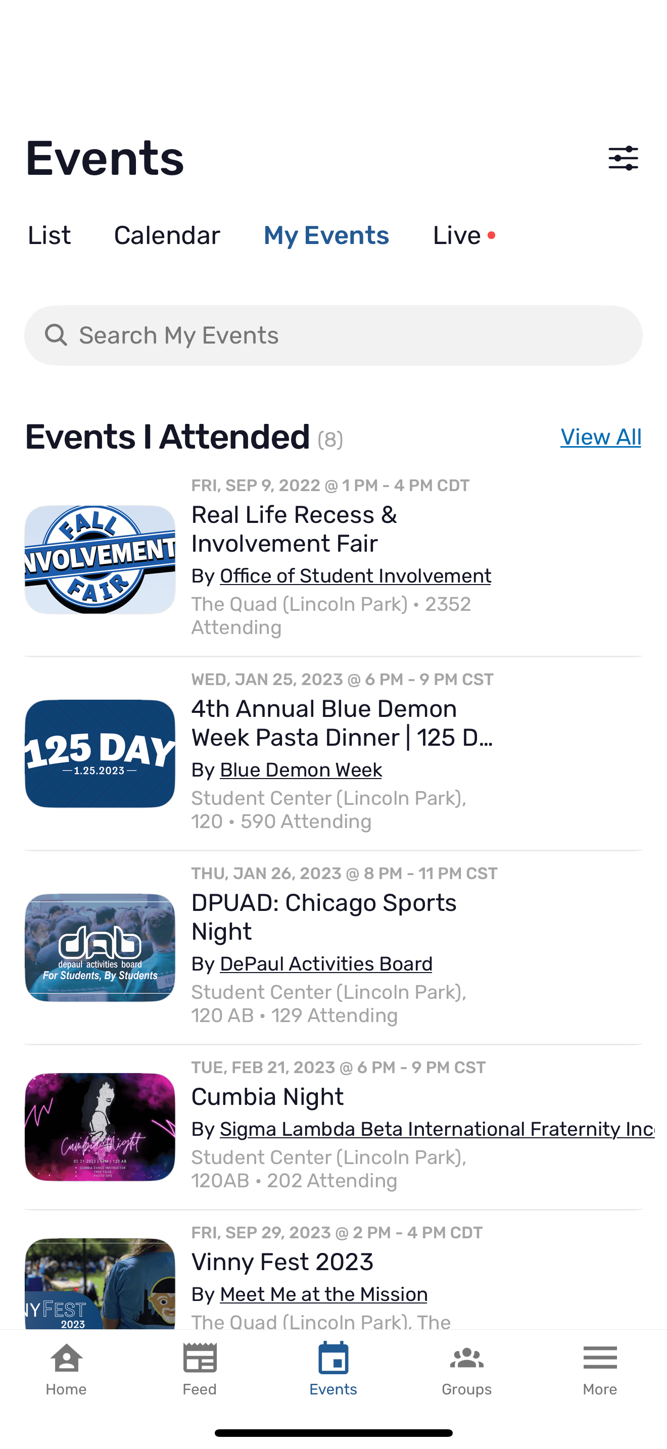
Many DePaul students find that the current DePaul app for finding events is quite frustrating. It doesn't feel personalized to the students nor does it make them feel engaged with the University. The app makes it difficult for students to find events that are going to be a good fit for them.
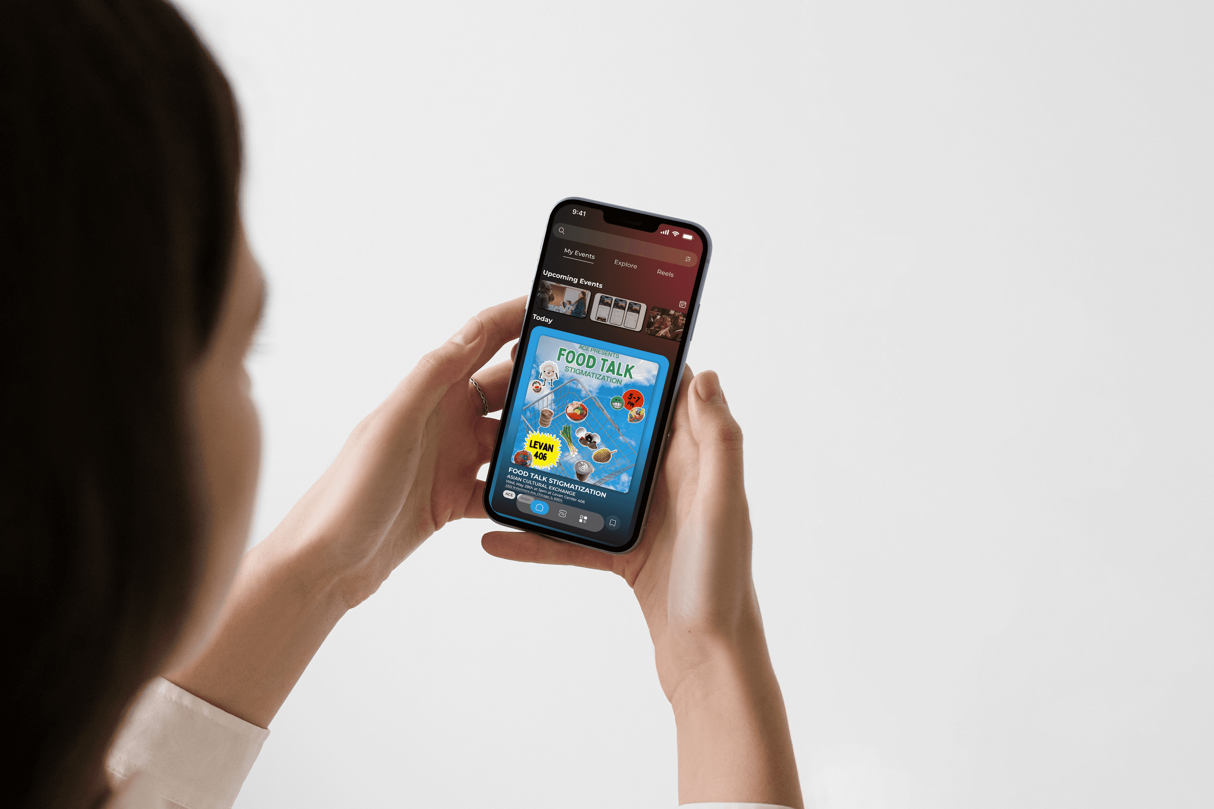
DeHub (current DePaul events app)
The Solution
A new app for DePaul students that is personalized to the person so students can find, engage, and participate in University events.
Research & Discovery
Our team conducted user interviews with current DePaul students to get a general idea of university students thoughts on the current ways in which they are able to engage with campus events. From these interviews we were able to gather useful data to guide the purpose of designs for our prototyping and wire framing phase.
User Interviews Key Feedback
To get a general idea of Ruan's China Kitchen's existing site, I conducted a heuristic evaluation using Nielsen's 10 Usability Heuristics. I also conducted cognitive walkthroughs with 4 participants—in various age groups—to see how users are actively engaging with the site. From the data I gathered I then pinpointed user pain points to guide my redesigns.
Research & Discovery
DeHub App is not personalized
Students do not feed connected to the University Culture
Current UI is not eye-catching causing students to be disinterested in exploring the app.
To get a general idea of Ruan's China Kitchen's existing site, I conducted a heuristic evaluation using Nielsen's 10 Usability Heuristics. I also conducted cognitive walkthroughs with 4 participants—in various age groups—to see how users are actively engaging with the site. From the data I gathered I then pinpointed user pain points to guide my redesigns.
Research & Discovery
Explore Page is not curated towards interests and similar events
Complicated Initial landing page
Guiding Focus
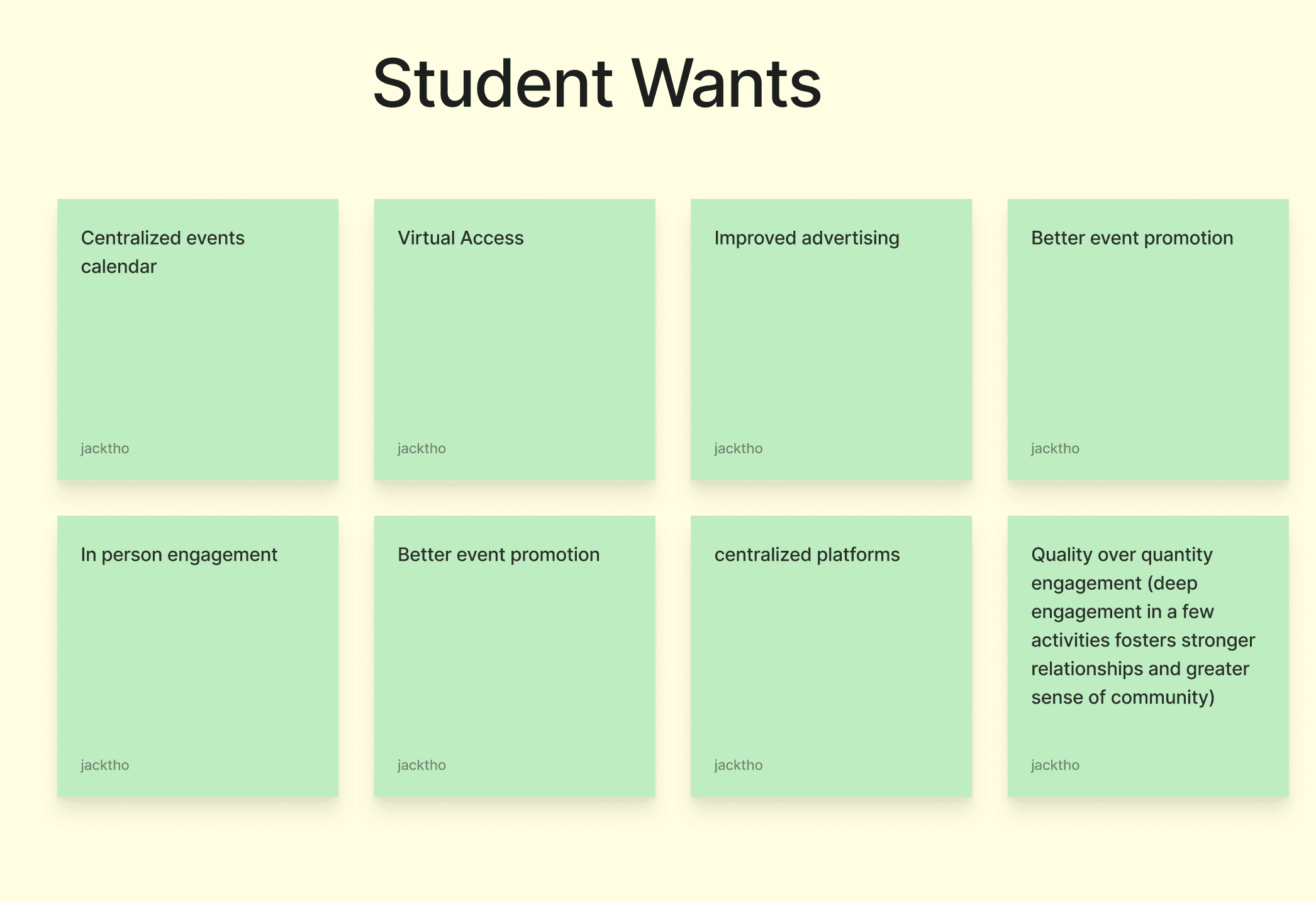
Based on our user interviews we had 3 main focuses that guided our design process.
People want improved promotion and awareness of extracurricular organizations and events.
There is a lack of personalized recommendations for students based on interests.
People want a centralized source of information for extracurricular events.
Defining a User
Before creating our prototype and wireframe, we generated a user persona to have a base for who we are designing for.
Primary Persona
Freshman University Student
Age: 18-22 years old
Location: Chicago, Illinois
Grade: Freshman
University: DePaul University
College: Jarvis School of Design
Etc: First gen POC student. Computer Science major. Interested in DePaul sports, design clubs, and POC community events.

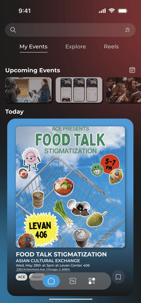
Prototyping
After generating a user to design for, our team went straight into prototyping & wire framing. We all contributed to each screen, making minor adjustments and collectively creating one uniform aesthetic that guided our screens. Because of our time constraint, we had to pick the most important screens that would be relevant to our user.
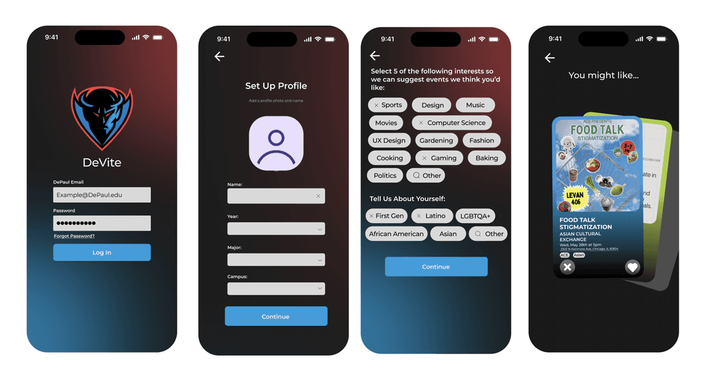
Design Considerations
DePaul University Colors
Interest selection to gather user data
Sliding cards with active events for data
Real DePaul clubs and events for realism
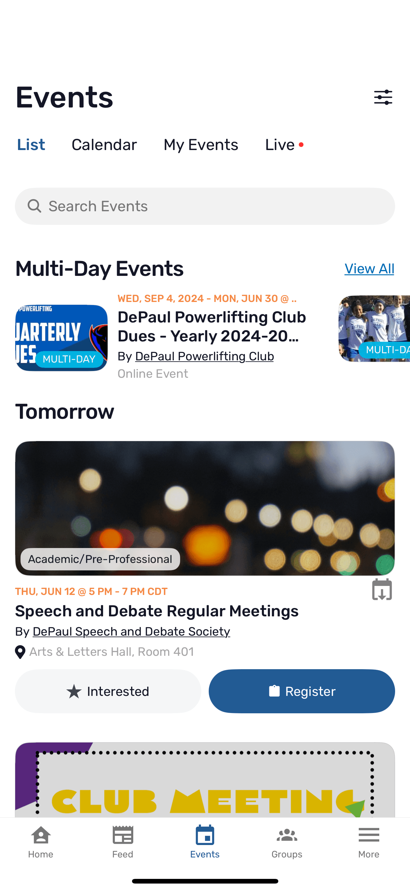
Tabs to explore club/event postings
Ticket system to remind users of event
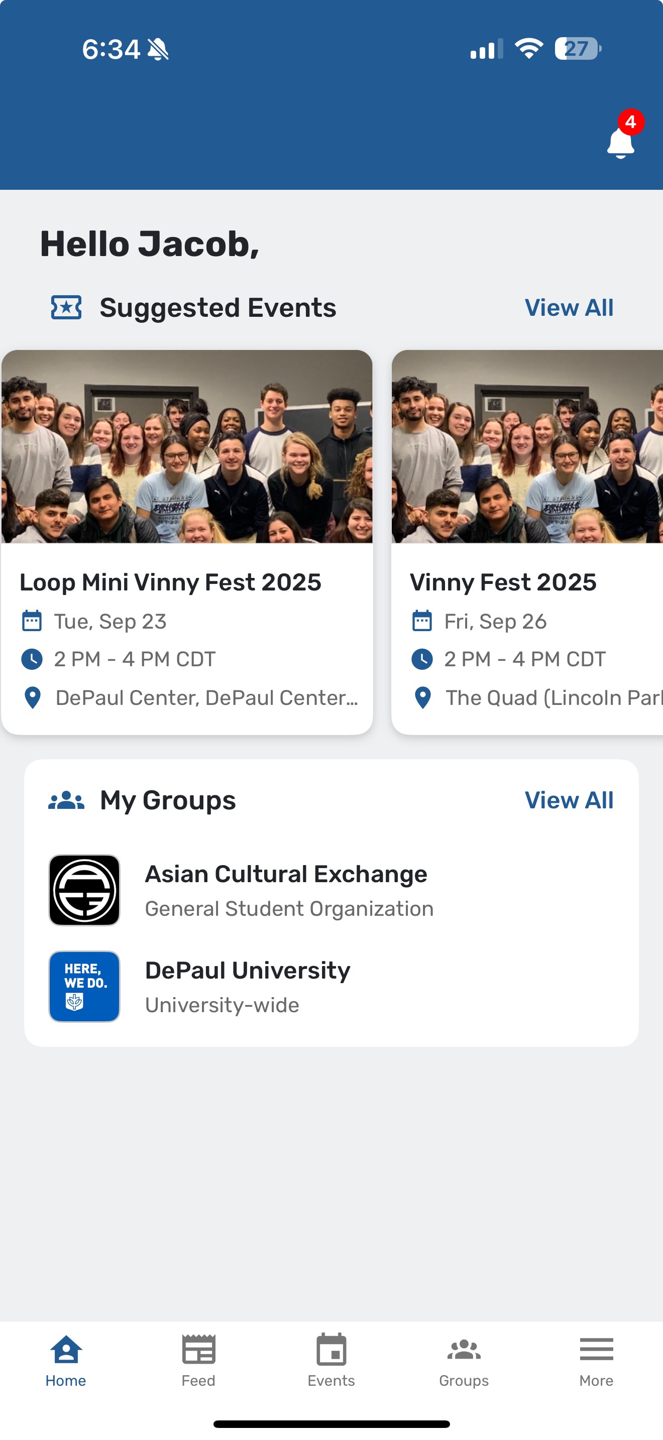
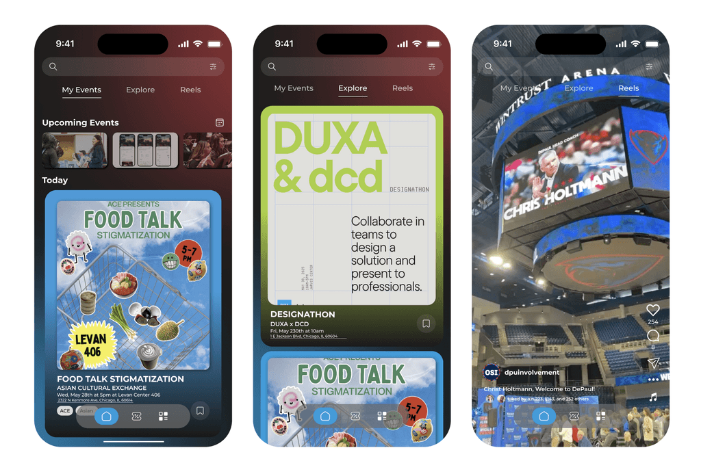
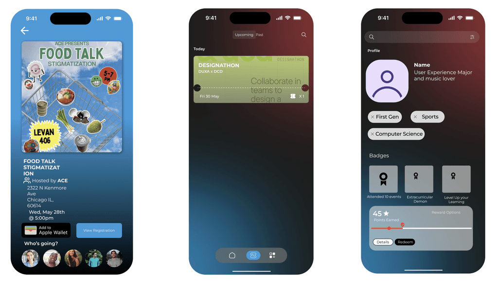
High Fidelity Prototypes
After designing our screens, we had only a few minutes left before the challenge was over. We decided to wire-frame all the existing screens together in order to create a realistic experience to present for the competition.
Key Design Solutions
Improved Personalized Experience
Interest selection portion of onboarding allows the app to gather data about the user and recommend club and events that are geared towards that user.
Limits the exposure of clubs that are not ideal for a user based on their interest
Makes user feel more connected to the university
Updated UI
Keeping the original DePaul colors, our new app modernizes key aspects of DeHub, while also incorporating other aspects of various popular medias
Organized content into chunks
Reflection
What I learned
Team Collaboration
Collaborating with other designers that have different styles of designing was very insightful
Taking pointers and advice from peers while also sharing your own insights created a cohesive designing environment that
also expanded my own knowledge of design
Real world experience of designing for a purpose rather than your own agenda
Future Improvements
User feedback to generate real world insights
Implementing motion design to for transitions
Collaboration with back end developers
Thank you for looking at my case study! If interested, make sure to check out some of my other works.
-Jacob Schmidt
works.